Global financial market participants are now speaking by collective record-sized gold silver investment actions.
The move to physical bullion and also into the less secure, fractionally bullion-backed derivative complex is now making monetary precious metals spot prices ramp higher.
Whether by design or sheer incompetence ∞QE policies ongoing are driving many to sell the fiat Federal Reserve note, and many other fiat currencies for longer-term bullion store of value bets.
The $2,000 oz gold price level has now fully arrived. And too silver is quickening on its outperformance catchup.
While the financial powers squabble over how many trillions they’re digitally keystroke out thin air next.
We’re gonna review a bit of the bullion beat down that has ensued since the mid-March viral spot price crash, briefly taking a gander at where we are right now and where we are likely headed soon enough.
Silver and gold are the respective number one and number two best-performing asset classes now in the year 2020.
The performance by both starting Tuesday this past week was superbly strong.
Gold blew through the $2,000 psychological barrier like a hot knife.
Silver made a run for $30 late last evening.
Neither retraced much in any profit-taking to close the week.
The gold-silver ratio has in a matter of a few months, broken the derivative driven near all-time high GSR we witnessed during the brief and intense viral spot price meltdown in mid-March 2020.

This important ratio pierced back into the high 60s this week.
In July 2020, Silver had it’s best one month run since late 1979.
If you are new and somehow stumbled upon our channel this week, go watch our June 26, 2020 video entitled
That short 5-minute video will give you one of our working thesis, for where this building bullion mania phase may go.
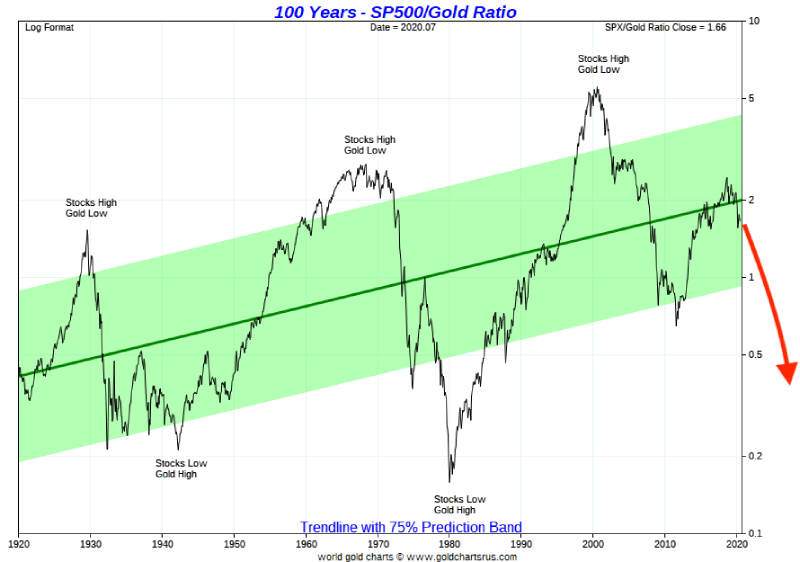
The S&P 500 stock market index is getting close to it’s a pre-viral crisis all-time nominal highs, mainly driven by 5 tech stocks, many of which may face AntiTrust breakups later this decade.
Meanwhile, viewers likely remember that we covered in our late February 2020 video where this S&P 500 vs Gold Ratio chart was likely headed as the gold bull gained pace.
Since that video, the S&P 500 index has lost over -22% to gold bullion.
Additional note. Watching the stock market mechanics of passive investing combined with the ongoing policies of ∞QE to proper up the corporate bond and insider connected stock market. It has become clear to me that The Federal Reserve US Treasury melds policy is to see the nominal numbers looking good… all while devaluing the fiat Federal Reserve note and the over hundred trillion unfunded liability pile.
The Fed is telling us all they want more inflation, the fastest way to get there is by letting the Gold price lead a raging commodity dull market.
In terms of this chart, I suggest this general trend will continue.
Moving onwards, to the major four precious metal price charts over this full fiat currency era.
Here we add already see somewhat recent manic palladium price action energy building platinum.
Now I know I have promised you all a Platinum Fundamentals video, and that is coming.
But for now, there are a couple of key points I would suggest we can glean already.
Before the viral crisis, and near-complete economic lockdown, I often wondered about what I believe are the two best long term value buys still silver or platinum. Which of these two precious metals’ long term price charts would ‘U’ or cup shape first?

Given silver’s monetary store of value role, I think the answer has become much clearer under infinite QE policies ongoing.
You may know like so many, that platinum is indeed rarer than gold. And if you think the wealthy rich Asian platinum jewelry bid is not gobbling up shrinking supplies. Well, then I got a bridge down near a swamp to sell you.
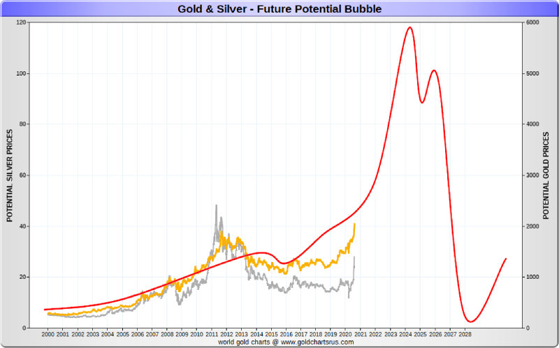
Before this 21st Century bullion bull ends, I expect all four major precious metals to all nominally spike and record price within months of one another, similar to how they did in the first quarter of 1980.
History rhyming would not be surprising.
Now let’s further put this recent silver run into an over 4-decade derivative price discovery-driven context.
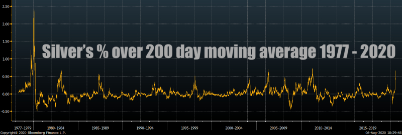
This chart illustrates silver’s price percentage over its 200-day moving average. It recently spiked to over 68%. You can see where that fits in a historic context.
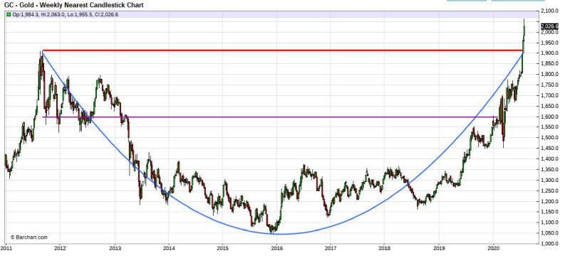
Looking back at the now completed gold price cup formation, tweeted today by Craig Hemke of TFMetalsReport.com
Let’s get a look at his silver version he put out too, for an idea of how this breakout just might in the months and years coming.

These built and building price cup formations are important. Once they are cleared the upside price energy that can follow. They can become the stuff of legend.
Check out this 1970 to early 1980 gold price cup breakout, over a four multiple from that 1978 gold price peak.
And on the silver side, more than a six multiple followed that late 1978 silver price peak.
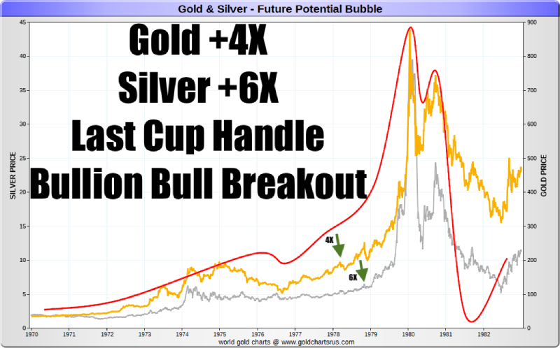
Here is where we stand again, this 21st Century.
If you are new here, stay to the end of this video and click through to learn more about why we think this silver and gold bullion bull market is just warming up, for the mania to come.
Late last week, NY Federal Reserve Investment Advisor, billionaire bond trader, and silver bull from the year 2011 onwards. Mr. Scott Minerd was back on Bloomberg, politely dunking on Tom Keene’s head. Gently reminding us all that early in this year in 2020 while in Davos, Scott declared silver his investment bet of the year.
Thus far is 2020, Scott Minerd has been silver spot price proven correct.
That’s all for this week, take very good care of yourselves and those that you love.