This past week, over 680 of you out there took part in a random bullion poll we posted.
The vast majority of you deem silver bullion to be the best bet out into the year 2025.
Today we are going to explore why silver bets are a building consensus across the investment world. Perhaps too why we probably all are underestimating the asymmetric potential of this bullion bet.
One that at current silver spot prices has limited downside, yet potential upside that requires further perspective now that we have entered a decade in which seemingly trillions are the new billions.
Hello, this is James Anderson of SD Bullion.
Friendly reminder that earlier this week, at SD Bullion, we released an over 158 yr round Gold Silver Ratio Graphic. The current Gold Silver Ratio on June 12, 2020, is still near 100 at the moment, a historically high level.
But given some of the data we are about to show, and discuss, it is unlikely the gold-silver ratio will stay that high over the next five years and throughout the remainder of this decade.
Late last month, the team at Visual Capitalist published their latest update of "All of the World’s Money and Markets in One Visualization."
An illustration using representative $100 billion fiat Federal Reserve note value equivalent squares to give readers an illustration of the wealth in the world in this year 2020.
The source data they used came from organizations like the Bank for International Settlements, Credit Suisse Wealth Report, IIF Debt Monitor, the private Federal Reserve, Forbes Magazine, Fortune 500 data, and other sources.
Today we are going to run through a bit of this data for the context where both silver and the gold market stand respectively.
And too we'll finish by giving you an update on the physical silver industry in 2020.
We have done videos on this channel highlighting How Much Silver is in the World research using historical data.
Once we finally arrive at the minuscule silver market, we'll dig into some related silver charts to see where we are in the potential mega silver bullion bull market building.
But first, back to the graphic on global wealth.
Warning many of these numbers are mind-bogglingly large.
Just for some perspective to somehow better wrap our minds around the scale and size of some of these figures.
When I say one billion seconds, that is nearly 32 years of time.
Conversely, when I say a trillion seconds, that is about 31,700 years of time.
That is about 400 human lifetimes of difference.
--
The U.S. budget deficit in this year alone is projected to hit $3.8 trillion. That is well more than double the previous record set following the 2008 financial crisis (a $1.41 trillion budget deficit in the year 2009).
Meanwhile, the Federal Reserve has announced “open-ended” asset-buying programs to support the economy, which will add even more to its currently exploding $7.2 trillion balance sheet.
Oh, and by the way, the US National debt just passed $26 trillion this past week. We can expect $30 trillion by sometime in early 2021.
--
Derivatives top this list of largest asset classes, estimated as high as $1 quadrillion or 1,000 trillion more in notional value according to a variety of unofficial sources.
However, because of their non-tangible nature, the value of financial derivatives are measured in two very different ways. The larger Notional Value represents the position or obligation of a contract, while gross market value measures the price of the derivative security itself.
It’s a subtle difference that manifests itself in a big way numerically.
Examples of derivatives include futures contracts, forward contracts, options, warrants, and swaps.
This illustration has a gross market value of derivatives at only $11.6 trillion versus notional market values of $558 to 1,000 trillion in total.
--
Moving on to a breakdown of total global wealth. $360 trillion according to Credit Suisse Wealth Report.
The vast majority of wealth is split between Europe, the USA, and Asia.
Africa and Latin America only account for about 4% of all identifiable wealth in the world by 2020, yet in their respective soil, the two continents combine to hold the most resources humanity will need through this Century into the next.
--
Global Real Estate accounts for $280 trillion in wealth. Nearly 80% of which is residential. A bit more than ten percent in commercial, and about 10% in farmland agriculture.
--
Total Global Debt as of the last IIF update was at $253 trillion. That is over three times the annual gross domestic product of the world. It is mostly governments and non-financial corporates that have been gorging on debt since the 2008 GFC. This trend is unsustainable.
--
Fiat Currency Supply typically consists of two aggregate measurements M1 vs M2. Narrow vs Broad currency account for nearly $100 trillion in wealth. Only some 7% or $7 trillion of all this fiat currency value, is in physical cash notes. The rest sits in digital accounts on databases as assets and or liabilities.
--
Global stock markets account for about $90 trillion in value, almost half of which is on US stock markets.
--
About 1/4th of all Fortune 500 wealth is now in only 5 companies you see here. Their combined wealth represents over 5 trillion in notional value combined currently.
--
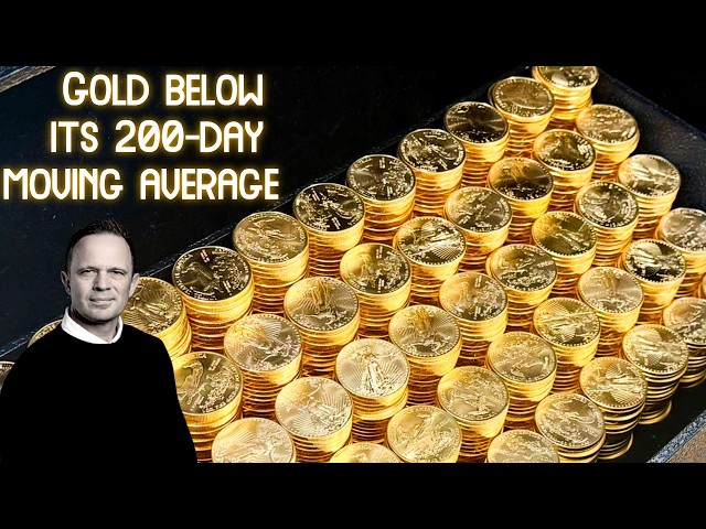
The physical gold market now has nearly 200,000 tonnes. Half of which is in jewelry, a high single-digit resides in industrial applications, and over 40% of the rest is split between investor piles and increasing in size government gold bullion vault stashes.
--
The world's billionaire class has over 2,000 known members, their combined wealth is about $8 trillion in total.
--
The Federal Reserve's balance sheet is about to pass them now sitting above $7.2 trillion rapidly expanding with no end in sight.
--
There is physical fiat currency cash again, remember we mentioned it was about $7 trillion total.
--
The aforementioned record budget deficit of $3.8 trillion this year 2020.
--
Then the entire cryptocurrency market, nearly $245 billion, 2/3rd of which is Bitcoin. The other now over 5,460 cryptocurrencies make up the remaining 81 billion in values.
--
Finally, we end with the ridiculously small physical silver bullion market.
They use the World Silver Survey's transparent silver pile figure comprising all the fractional reserved silver amongst the futures exchanges in China, London, and on the New York COMEX. Add in ETFs and other reporting silver investment hoards.
Even if we stretch and assume that hidden amongst private silver bullion buyers globally there is another 2.5 billion ounces of silver coins, bars, and rounds, that still puts the amount at less than $100 billion.
The point is not merely how tiny the physical silver investment market is.
But it is also how intertwined silver remains in the psyche of the world, knowing it is more trustworthy and a more dependable money than fiat currency.
It will not take much in investor flows to make this silver pile multiple many folds in the coming years. Once upward price momentum gets going, a pile on mania can certainly follow.
A simple look back at previous silver price high data can teach us many lessons.
--
The following silver related charts are provided by SRS Rocco Report.
This first chart illustrates the kinds of mines that new line silver ore comes from. Failing Copper mines could have an adverse time bringing new silver to market, while the next chart is going to show how hard primary mines have to work now to find new silver ore bodies.

Over the last decade and a half, the average yield of silver ounces per tonne of ground mined has been cut by more than half.

The next chart shows how silver mine production has not kept up with gold mine growth, and 2015 was the recent peak for silver production.
By the way, that new silver to gold mine ratio is currently about 7.5, so once silver's store of value demand really gets going it is not hard to rationalize gold silver ratios back below the 2011 low of 33. The 20, teens, even single digits in a currency crisis mania are possible.

Finally here was Steve Saint Angelo's work regarding the recent viral mining industry shutdowns we just went through lasting months of time.

We can certainly expect new silver production to be down again in this year 2020.
--

The LEFT side of this chart illustrates silver bullion flows into four of the largest silver ETFs in the world:
Over 220 million oz Silver Bullion into these ETFs last year or so, over 1/4th of a year of new line silver mined.
The RIGHT side of this chart the blue value held line akin to its action from 2009 to 2011, lagged but eventually, this kind of record silver as a store of value dead should drive the spot Silver Price into the cup formation rerunning back beyond $25 then to the $40s of a retest of the old silver price highs.
This time I don't expect we're coming back denominated in fiat Federal Reserve notes.
--

This Indian silver chart reminds us that this all happening without the world's largest silver buyer really taking part.
What happens when they return wanting their more typical annual +200 million ounces of Indian silver imports?
At the moment, London silver hoards are being raided, and I am watching the Comex see when this second historic drawdown of silver begins in earnest.
--
Here is what SD Bullion's CEO Tyler Wall had to say this week regarding ongoing silver supply versus demand factors.
“Major silver minting operations that supply SD Bullion with privately minted silver rounds and silver bars are now flying in silver from London and Zurich!
This is never done in normal markets due to the high cost of transporting silver via plane overseas.
Furthermore, one of the largest US refiners has seen a 75% decrease in base silver material coming into its plant for processing versus normal. The main reason they listed is that they are not seeing silver coming in from Mexico due to the mines being shutdown.
We have received a lot of questions, as you would expect, regarding premiums over the last 3 months. The first wave of premium increases in March/April spiked due to a shortage of readily available minted products. The higher than normal premiums have persisted as silver mints have been delayed versus the demand for their products. In recent history, this has been the cause of most of the premium spikes and not a shortage of underlying silver. At the peak so far in 2020, major mints were delayed 8-12 weeks out. They are now 2-3 weeks out. The sentiment in the market is that premiums will decrease if the mints become caught up so establishments can get closer to just in time inventory. Thus, some large players are very likely to have been reducing excess inventory with the hope they will have a chance to reload from the wholesalers/mints at a lower premium. However, one also should take note that a lot of the establishments we work with are operating off a FIFO (First In First Out) based accounting system and setting price accordingly. By returning to a just in time inventory system and combining it with FIFO, the price will be based more closely on the cost it now takes to buy base silver.
They are taking delivery from London and not the COMEX because of the difference in future pricing...cheaper to take from London than Comex and fly it across...but now it's reached almost equilibrium.”
--
When the silver price begins its monumental climb higher, where will we source the store of value silver that is going to be increasingly in demand as a result of these “trillions are the new billions” bailout economy?
We guess judging by this week's poll, many of you out there are already well-positioned for this coming run.
That is it for this week, thanks for tuning in. Take care of yourself and those you love.