
To understand if residential real estate may be undervalued or overvalued it helps to measure it vs precious metals like silver bullion. See average house prices vs silver in the USA, UK, and Australia. Unlike fiat currencies which are created from nothing, silver bullion has a limited precious supply.
The Silver vs Home Price Ratio is a way to measure if average home prices are historically undervalued, overvalued, or fairly valued.
We use silver for this measurement because it is one of the most enduring monies we have for measurement.
All all other currency derivatives debase and vanish given enough time.
in order to see true value in charting asset classes, we suggest measuring stuff vs stuff to garner a truer sense of what is under / over / or fair value.
Since 1971 to date, we have been living under a full fiat currency standard. We are talking almost 50 years time. That means, most people who are alive today only know times when nearly each and every currency supply has been expanding.
This is perhaps why the persistent misconception that home prices always go up still exists (or at least until the 2008 Financial Crisis).
We suppose others may also think that bond prices always go up forever too.
Others too may think that stock or equity prices always have central bank backstops (or perhaps not).
The following chart shows average US house prices in US dollars since 1964. The same year silver was almost totally discontinued from our circulating coinage.
Average US House Prices in US Dollars (1964 to 2017 AD)
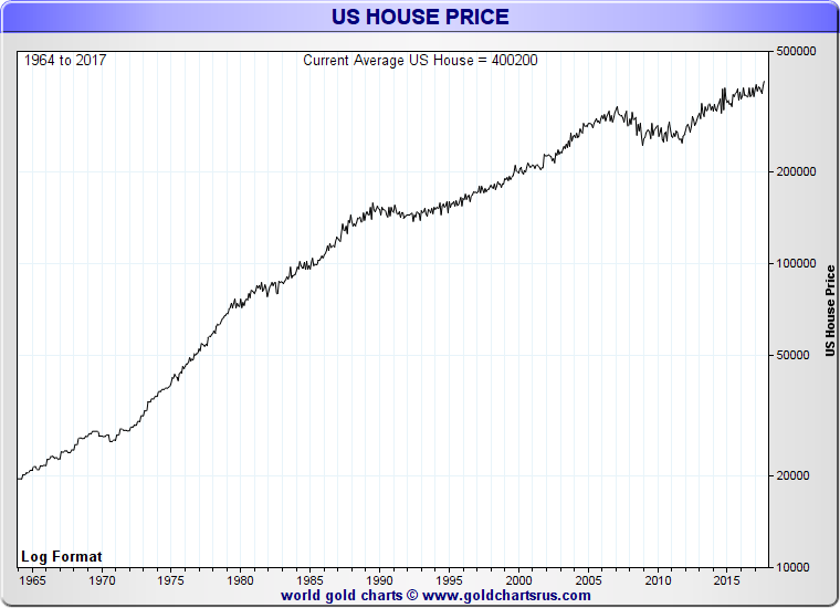
According to the chart above, the average price for a home in the USA is now over $400,000 USD.
We suggest that this data is somewhat skewed for two main reasons.
First there are newly construsted home sales would likely again dry up again in any future financial crisis (e.g. similar to 2008).
Secondly the average US price data is misinforming due to the amounts of record priced housing bubbles in large metro centers ongoing (e.g. San Francisco, Portland, Austin, Dallas, Denver, etc.).
Median Price Houses in the USA
The exact middle US house price point of non-new home sales is currently much less than the ‘average’.
The median price of existing homes (not newly constructed ones), where half the US homes sold for more and half the US homes sold for less, is currently $250k USD.
Average joe American makes just under $60k USD a year.
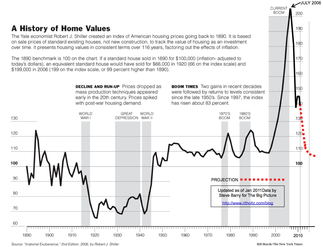
Let us also examine a longer term chart that expands outside of the post 1914 central bank era to give us more perspective as well.
120 Year US Home Value Chart 1890 - 2010
Today in the year 2018, the United States’ largest generation in terms of population and aggregate wealth (baby boomers) moves into a 65 year old retirement age at a clip of about 10,000 per day. This trend began in the early 2010s and continues until about 2030.
About half of the much younger house buying aged millennial generation currently lives paycheck to paycheck.
Many are struggling under the burden of record sized college loans unpaid (approximately $1.2 USD trillion).
Who (other than hedge funds) will be buying the currently unowned, under serviced, and soon to be sold inventory of US houses?
Will they be able to do so as and if interest rates rise long term? How might this all look if Negative Interest Rate Policies (NIRP) are implemented?
Regardless of Federal Reserve medium term policies, by studying and understanding the USA’s median and average price home data to silver values, you can garner a better idea of when housing may be expensive or cheap in terms of silver bullion ounces.
Average US homes were cheap in price perhaps at the peak of the last bullion bull market in 1980 yet financed with extremely high interest rates (+20%) back then.
Compare that versus average US homes being overpriced during the early 2000s US housing bubble and the most recent reinflation of housing prices thanks to record low interest rates (as low as 3.3% in 2012).
Silver vs House Prices 1964 - 2017 (USA)
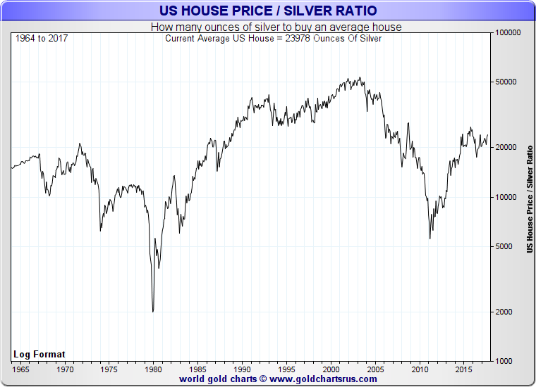
Perhaps we will see an echo of the last 1970 - 1980 silver vs house price cycle from severe silver undervaluation (see years 1971 & 2003 ) to potential silver overvaluation ( see 1980 & 20??).
It would not surprise us to see average house prices in the USA to peak at or even below 5,000 oz silver vs average US house price. At today’s US dollar price that would require a silver price of over $80 USD oz.
Of course this silver vs house spike could go lower than even the 1980 price peak. Yet we feel it conservative to presume the silver vs home price ratio will eclipse its 2011 high before this 21st Century Gold Rush fully plays itself out.
Even some of the world’s largest bond trading portfolio managers (e.g. Harley Bassman at PIMCO) politely calls for the kind of future precious metal price reversions we expect ahead.
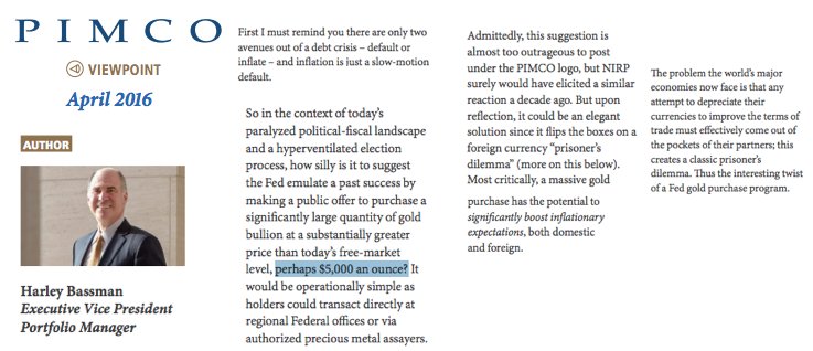
Federal Reserve could Buy Gold at $5,000 USD oz to create needed price inflation

If such a ‘drastic’ scenario were to play out (e.g $5,000 USD oz gold) one would rather reasonably expect the gold silver ratio to tighten lower than its current near 80 level.
A reversion towards a gold silver ratio of just 50, in this higher $5,000 oz USD gold price scenario brings about triple digit silver prices.
Judging by the M0, M1, and M2 data in the Santiago Capital fund's data above, a $5,000 oz USD price would still be deflationary in terms of the amount of US dollars and other fiat currencies in the global financial system today.
100 year Gold Silver Ratio

In 1964 the gold silver ratio hovered around 27. By 1980 that ratio spiked to as low as 15.
Even a match of the 2011 gold silver price ratio of just over 30 could substantially lower the of average and median prices home values in terms of silver today.
If you want to buy more home in the future (residential or for cash flow investment reasons), perhaps now is the time to be acquiring silver bullion aggressively.
The questions of how we get from here to there is what confounds us and most other bullion bulls.
Not so much if, just specifically how and when exactly will this long term retracement cycle complete itself in the United States and elsewhere.
Look elsewhere in the developed world as well, where housing bubbles are even more outsized, exponential, and obvious.
How might all this play out in terms of silver vs average house prices elsewhere?
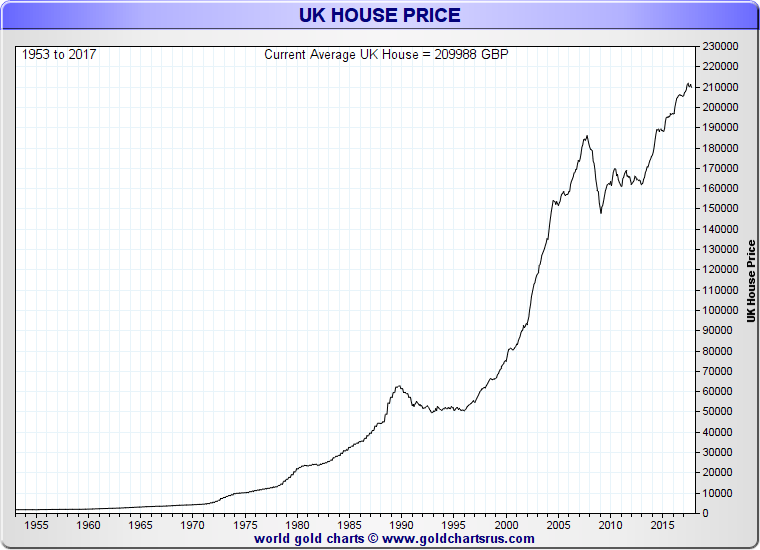
UK Average House Price Chart 1964 - 2017
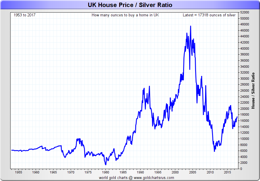
UK Silver vs House Prices 1953 - 2017
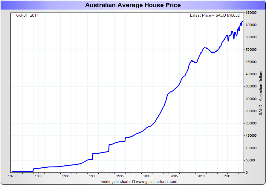
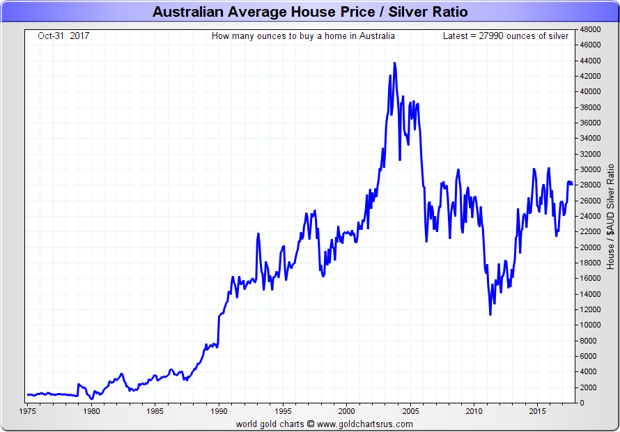
Australia Average House Price Chart 1975 - 2017
Australia Silver vs House Prices 1975 - 2017
You like these Silver vs House Price insights?
Be sure to pick up our free 21st Century Gold Rush.